Monitoring
The system includes a monitoring capability which produces an
informative real-time display shown here:
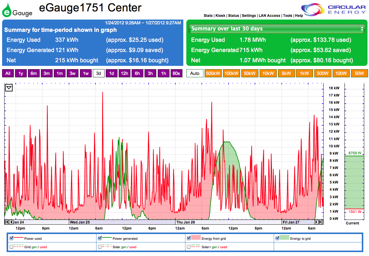
The graph displays most of three 24-hour periods beginning at
9:28AM CDT on January 24, 2012 and ending at about the same time on
January 27. Light green areas indicate times when solar power exceeds
household usage, and when the excess power is purchased by CPS. Pink
indicates usage exceeding the power generated by the solar system, and
when the deficit is made up by power purchased from the grid. The small
panel on the far right gives a second-by-second indication of the
current status of the system. At the moment this display was copied,
household use was 1,501 watts while the system was generating 8,769
watts, leaving a surplus of 7,268 watts which was returned to the CPS
grid.
The blue and dark green upper panels show estimated measures of the
relative contributions of solar and grid power. The row of purple boxes
above the graph set the time period over which performance is graphed
(note that the 3d box is highlighted here). The row of orange
boxes controls the vertical scale of the graphs (set to auto scaling
here).
The continuous dark red line indicates our electrical power usage,
which is highly variable over time. Most of the peaks occur when our
heating system (heat pump) is running. Prominent peaks begin at around
6:00PM when passive solar heat gain in the house declines and the
heating system comes on. Peaks are reduced at bedtime when thermostat
settings are lowered, but recur at about 6:00AM when the heating system
comes on again.
The system generates power during daylight hours (between about
7:30AM
and 6:00PM at this time of year). These times are represented by areas
below the dark green line on the graph. The extent and shape of each of
these areas reveals local weather conditions during each of the three
days shown:
- Tuesday, January 24 was extremely cloudy, with light rain falling
most of the afternoon. The small area under the green line on the graph
reflects the absence of direct sunlight, although there was still
enough light to generate some power. There was little passive solar
gain in the house which resulted in frequent running of the heating
system during the daytime.
- There was more rain during the early morning hours on Wednesday,
but by dawn the skies had begun to clear. Early morning outside
temperatures were mild (55° F at 7:40AM). The area under the green line
was considerably larger than it was on the previous day, but the
daylight hours were marked by intermittent sunshine and clouds which
resulted in its irregular shape.
- The early morning
hours of Thursday, January 26 were cool (42° F at 6:50AM) which led to
more frequent running of the heating system.
The daytime that followed was cloudless with brilliant sunshine. These
conditions are reflected in the amplitude of power usage (red line)
from about 6:00AM to 8:00AM, and the size and shape of the area under
the green line for this day. Note also the usage peak at about 10:30AM
when the electric clothes dryer was being used.